♥︎★♣︎♦︎
Who, what, why
Once upon a time, it was seen as a strength to be an established company doing business for 10+ years.
Now, in the age of AI, it made us more likely to be seen as irrelevant. Our product strategy was evolving faster than ever, and the design team knew it was time to update our brand to do the same. The key was convincing leadership.
I teamed up with Tim Lucas, a Product Designer on the team, and we centered our pitch around this idea:
Affecting perception → drives behavior → drives performance
Constraints
–– Time ––––
It was the end of November and we had a big product launch moment coming in January. We knew coupling the brand refresh with it would increase the impact of both, so that left us with just 2 months to pull this off.
–– Team size ––––
Being the only Brand Designer in the company, my bandwidth was limited. Fortunately, one of our Product Designers was a design-founder at another dev tool company and wanted in on this! Despite being on opposite ends of the globe (Texas and Melbourne) we teamed up and found ways to stay in sync.
Success looks like...
–– Standing out ––––
Not just standing out from other AI dev tools, but for the right reasons. We want to be bold, yes, but also show that we are built for enterprises and set the pace for the industry.
–– Iteration-ready ––––
We knew this wouldn't be a "one and done" effort, especially given the time constraint. The end result needed to be a baseline system that would be flexible and inspiring enough for us to build on as we grow.
Exploration
Tim and I had very little time overlap during the working day, so we would "hand off" our scratchpad Figma file each day, waking up to see new frames added and comments on what we'd done the day before. We sweat the details on the things that we felt mattered most: the typography and the color palette.
We settled on a core "vibe" of Retro Futurism, which would tap into the nostalgic feels of our dev audience, but allow us to create forward-thinking, optimistic moments in a way that says "We are leading the way, come with us into the future."
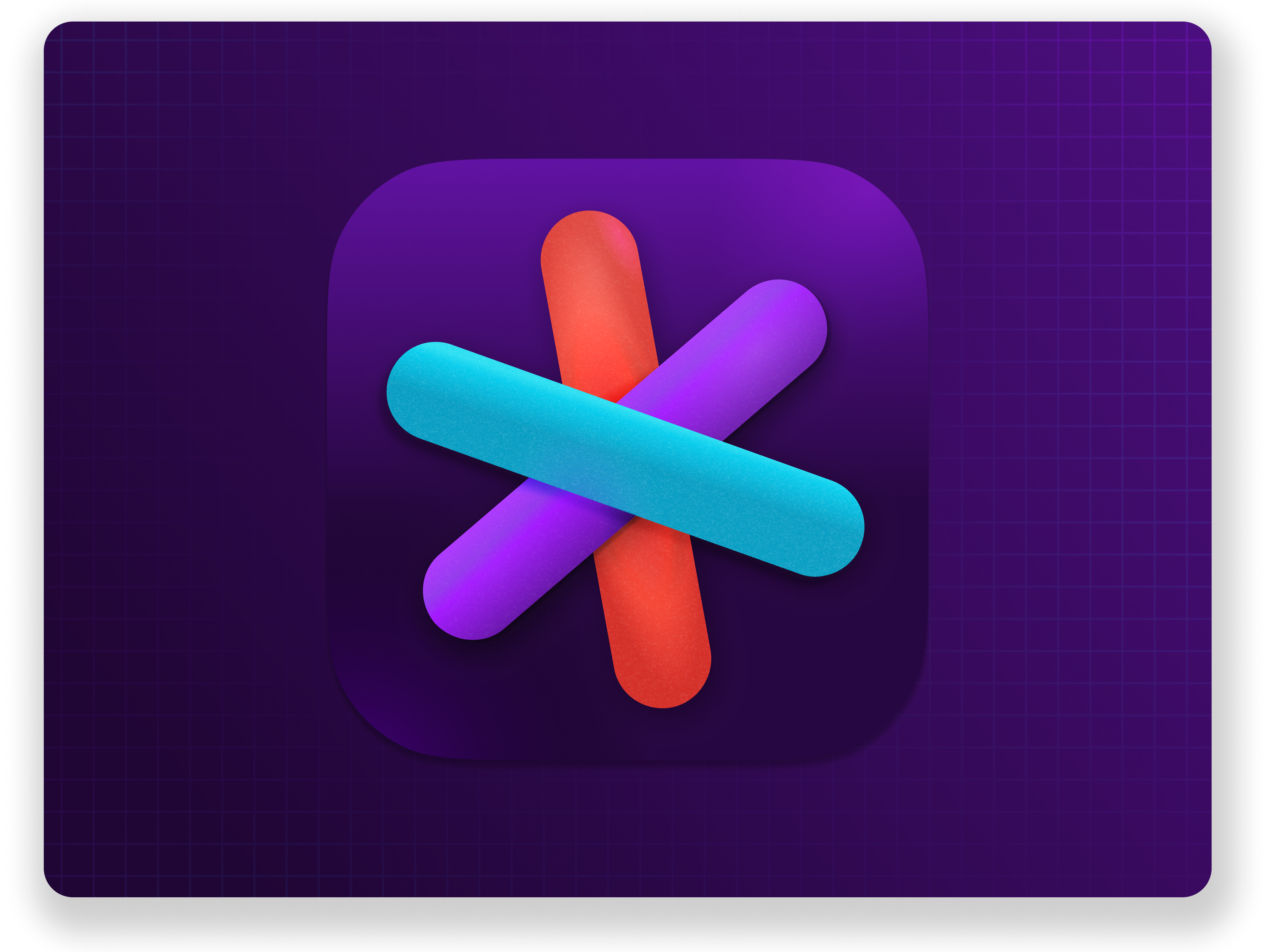
Logo
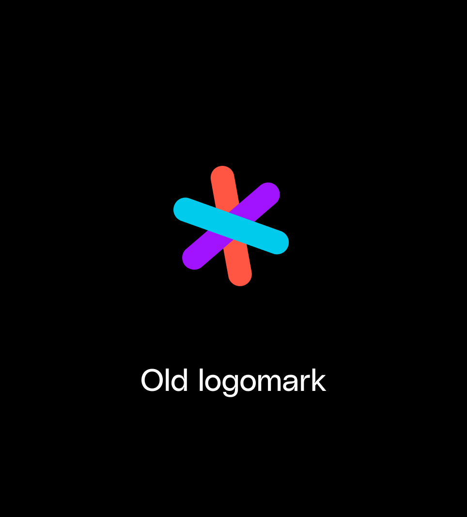
I had actually drawn up the new pictogram concept months before, letting it marinate in my drafts folder. The old mark was a sort of generic asterisk shape without a story and couldn't stand on its own without being in full color. This made it inflexible and impersonal. Each time I would place it in a new design, I would think "we can do better."

When it was time to polish it up and , we looked for fonts that would echo the same angles and provide a counterbalance to the blocky corners. Something very human, but bold and technical.
With our company name being so long, we prioritized a taller x-height so it wouldn't feel too "squashed."


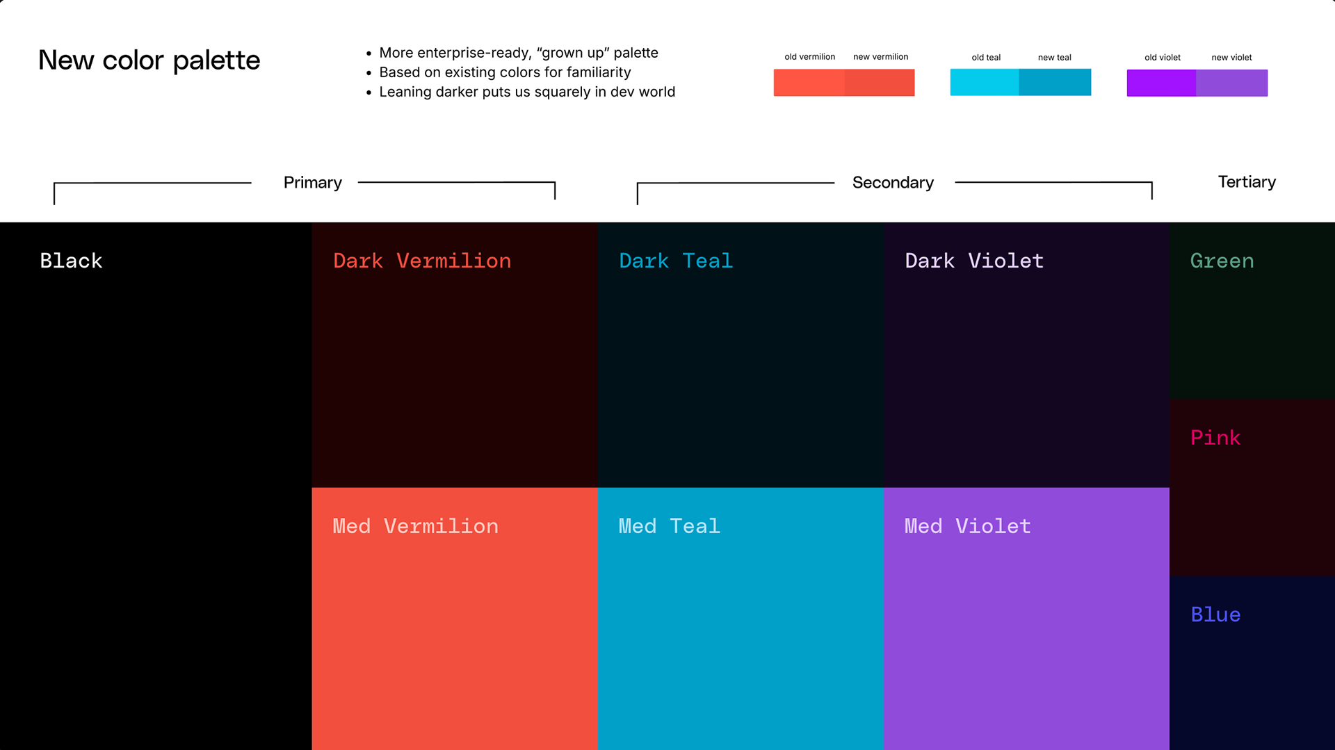
Color palette
Our previous color palette relied on 3 highly saturated colors. This was great for creating colorful moments and strong associations for our brand. However, it was a slippery slope into "circus" if the balance wasn't just right. This made it difficult for folks to use our brand system in a way that struck the right chord.
So, I re-tuned our core palette to be richer, more jewel-toned, which would lend itself to the retro-futurism feeling we were going for.
We reduced the primary colors to just one → Vermilion. This would be the default for our evergreen brand touchpoints.
Rather than giving folks a huge palette to choose from when creating compositions, we instructed them to opt for monochromatic. Ex: Dark [vermilion] with medium [vermilion] accents, and light [vermilion] text. Then they could swap [vermilion] for another color like [teal] or [violet] if they needed more options.
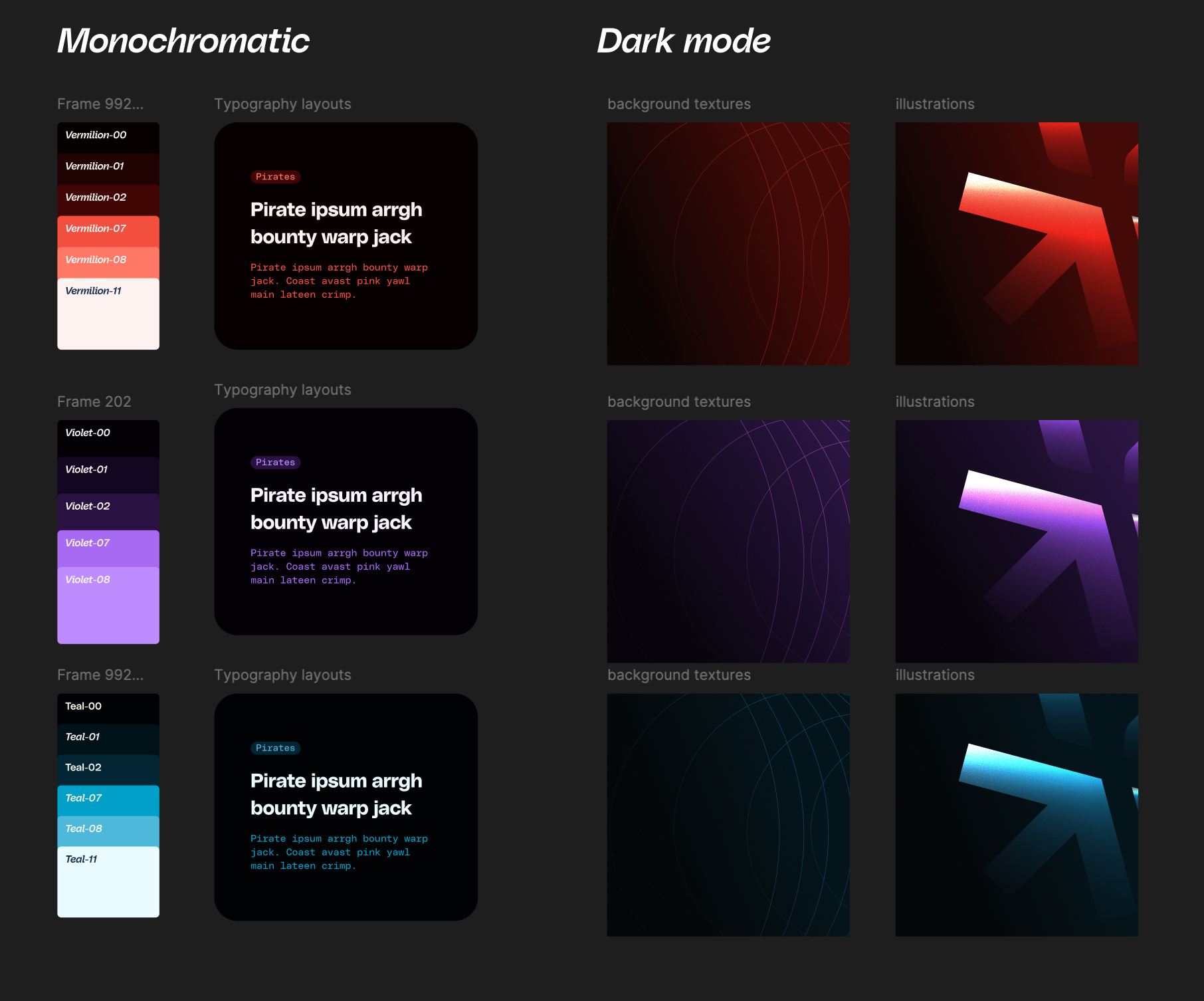
Visual system
Using our new color palette and "retro futurism" vibe, we developed an illustration system that could be used 100% in Figma. We leveraged blend modes like Color Dodge and textures like noise to add dynamic effects in an instant.
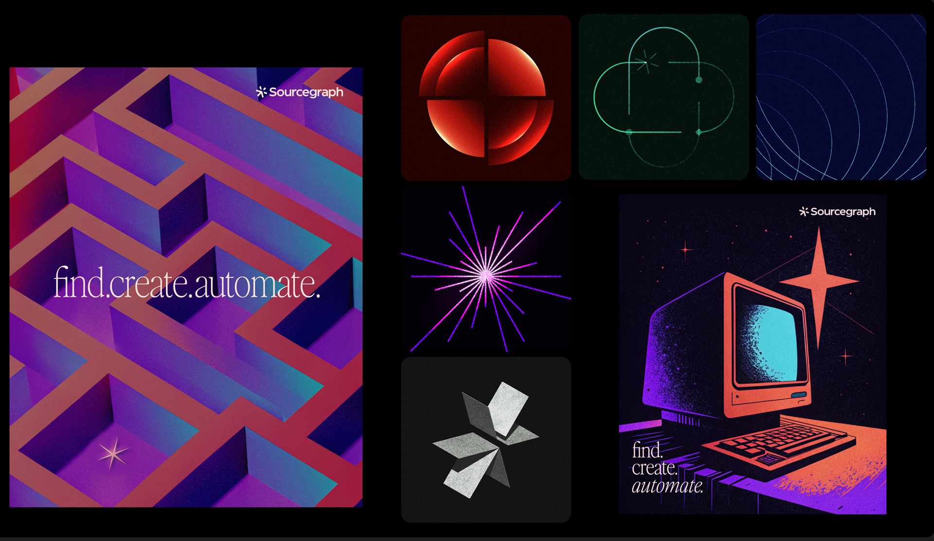
We imagined a flexible illustration system of abstract glyphs combined with a jewel-tone palette to create a Retro futurism feel for all kinds of placements. From simple backgrounds to highly expressive posters.
Enablement
Enablement is a key piece of every successful brand refresh. Making sure folks know where to find the right pieces and how they fit together is important.
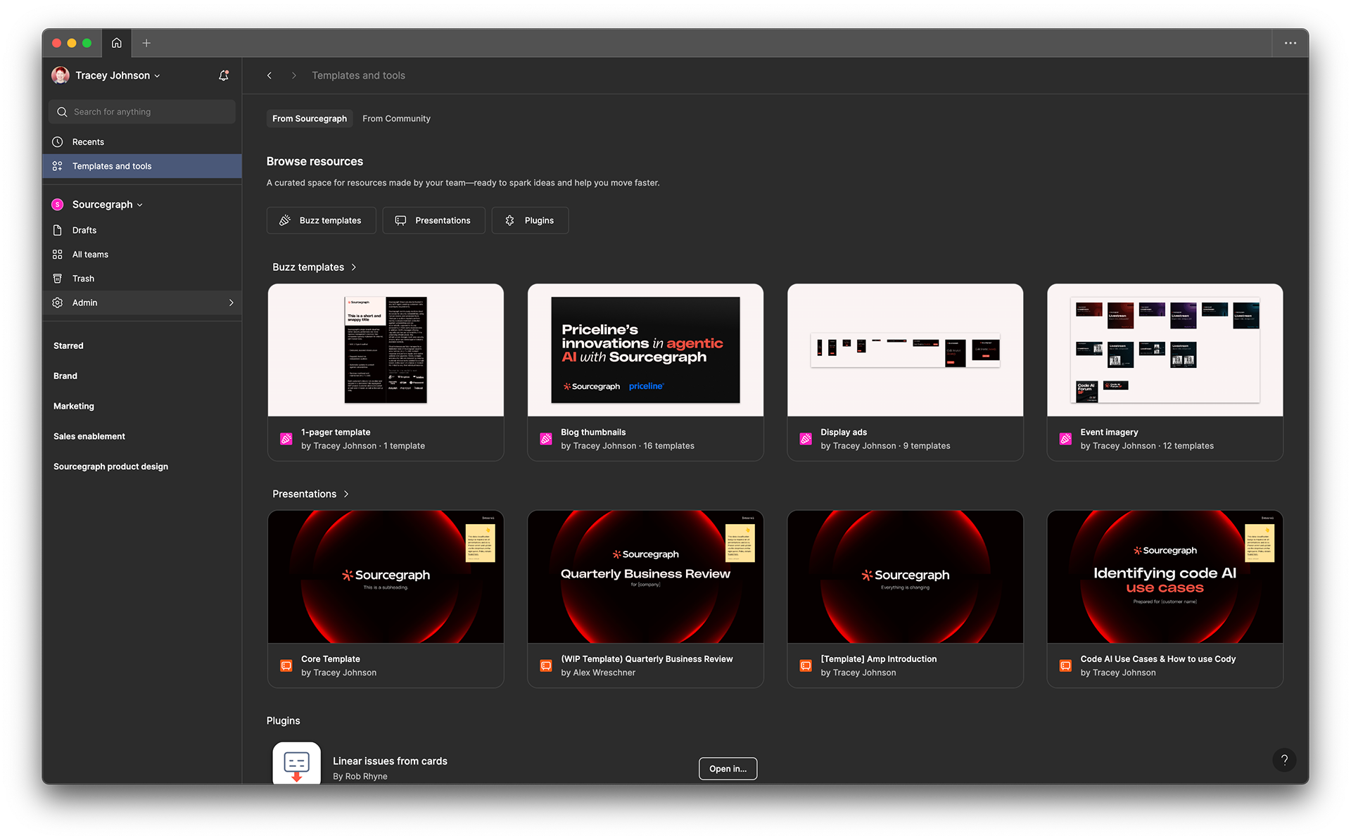
That's why we created a simple Brand guide in Notion. It's a living repository of downloadable assets and guidance.


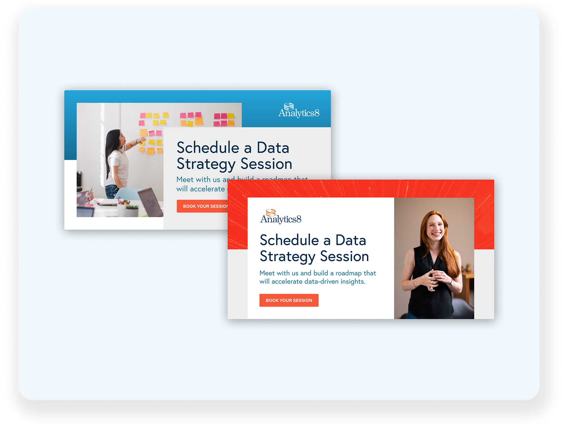
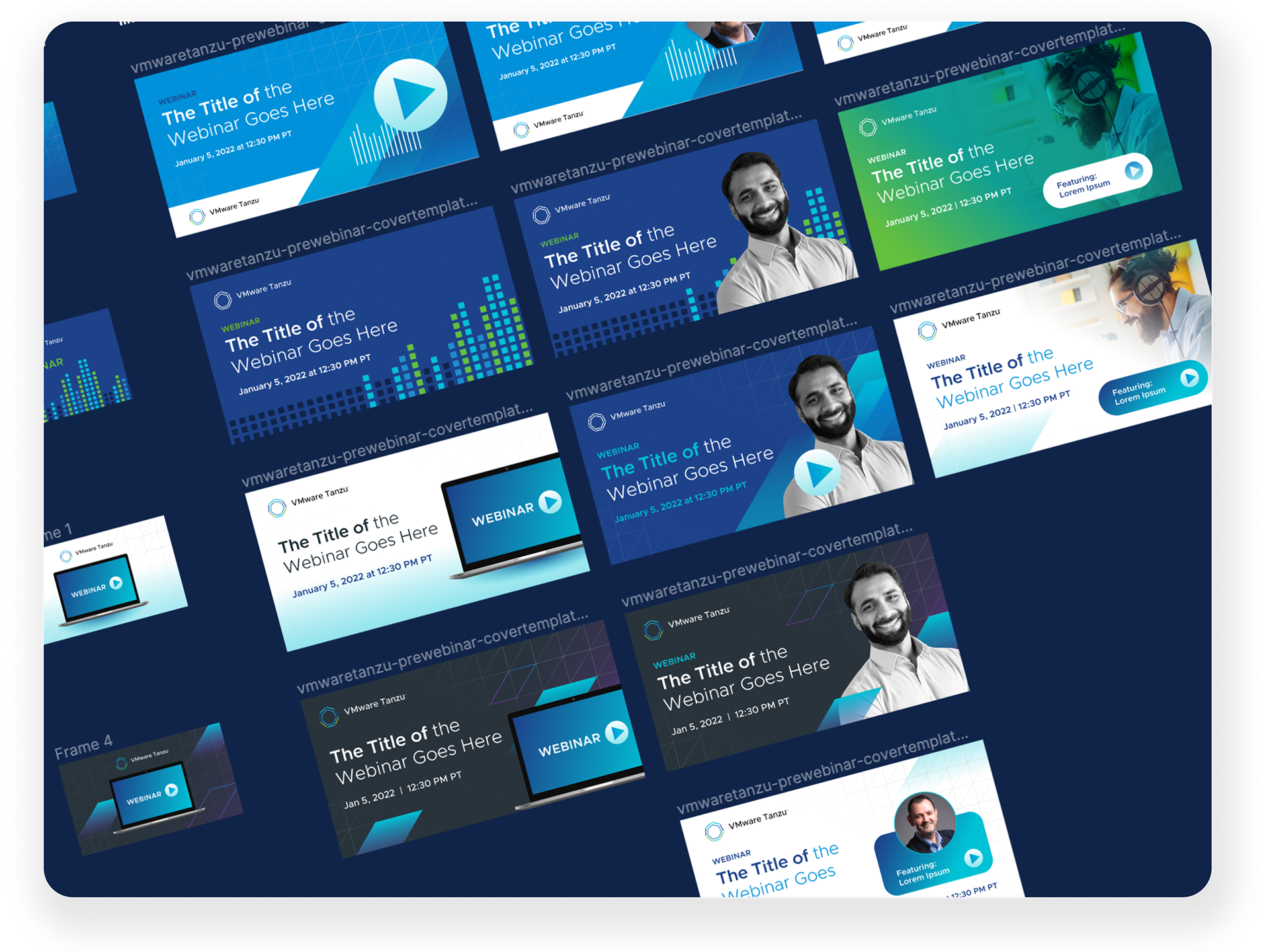
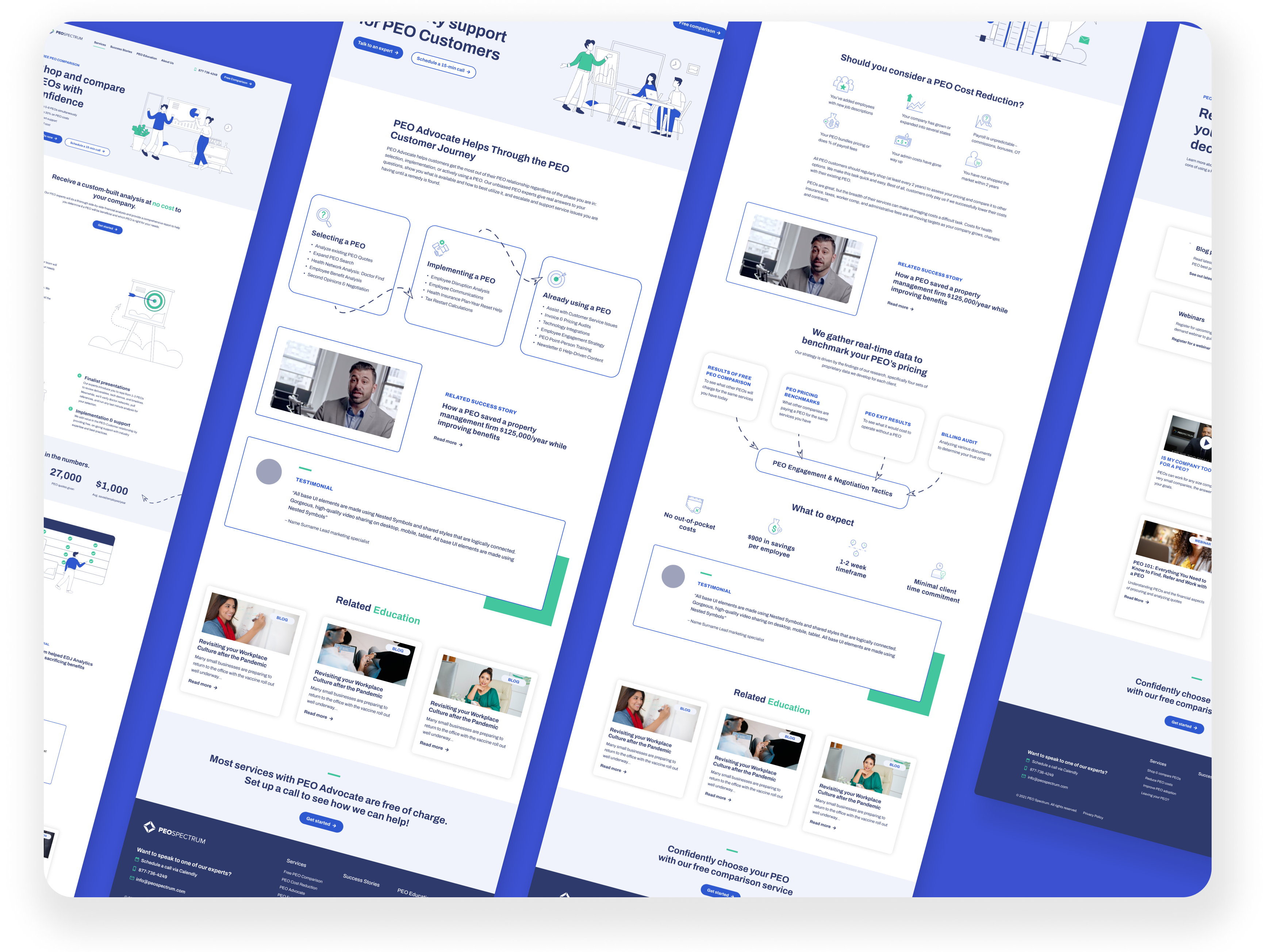
Another important piece of the enablement puzzle is templates! This is my favorite tool as a solo IC serving an entire org. With Figma Buzz and Slides, I've been able to templatize just about everything...from blog imagery to ads to every type of sales deck needed.
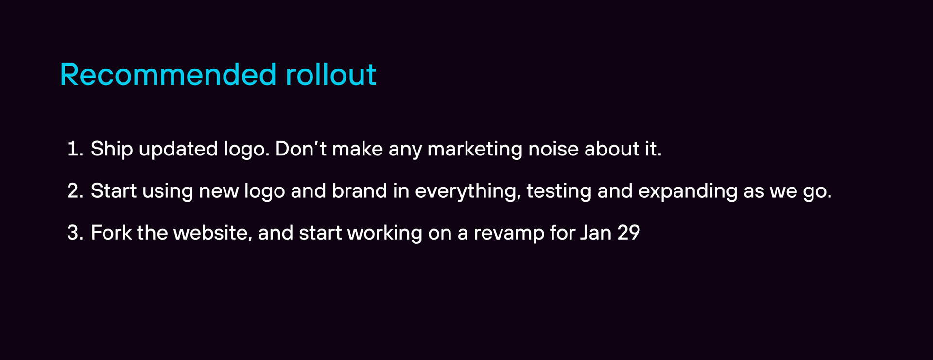
Intentionally unfinished...
I'll end this case study with a note about the approach we took to rolling this entire thing out, which may seem strange to some. This was a project that was never intended to be "complete". In fact, it's still being worked on today.
You'll see below a screenshot from one of the first slides we made when planning this effort. Some might look at this and think that sounds maddening. But an in-house brand designer's work is never done. As long as this is communicated clearly to the org, it should leave the door open to new possibilities you maybe wouldn't have discovered had you set an end-date.