Website ReDesign, Brand-aid
January 2020
Agency Credit: Digital Reach Agency
PEO Spectrum needed a fresh website to reignite its marketing efforts and improve overall usability. Their website was outdated, clunky, and lacked a cohesive identity. They weren't ready for a full re-brand, so we used their existing logo and build out a new look.
My role on this project consisted of developing a refreshed visual design system (we call this a "Brand-aid"), wireframing, and mocking up the new website.
Constraints
⏰ Time
The client wanted to expedite the "brandaid" and website process in order to meet their internal goals.
💵 Budget
The client's budget was also quite limited so we would need to create templatized pages and components.
🤔Uncertainties
Peo Spectrum's team was pretty adamant about not using any stock imagery on their homepage. This made it challenging to deliver the human, personable feeling they wanted.
Defining success
👏 More engagement
One of PEO Spectrums primary KPIs for their website redesign was to increase overall engagement and, of course, conversions.
✨ Having a more flexible design system
One of the chief complaints we heard from the client was that their brand experience felt limited and outdated. One of their primary goals was to have a compelling new collection of style elements that could work well across different mediums, including future ad creative.
Moodboards
We kicked off the project with a Discovery call between the Creative Director, myself, and the client's primary point of contact. Using the answers they provided, we started by establishing an overall style through a couple rounds of moodboards.
We landed on one with a strong white/grey base paired with electric pops of color.
Simplicity was the new name of the game for this bad boy. I took point on these, however, my CD and contractor offered plenty of helpful feedback and suggestions!
Simplicity was the new name of the game for this bad boy. I took point on these, however, my CD and contractor offered plenty of helpful feedback and suggestions!
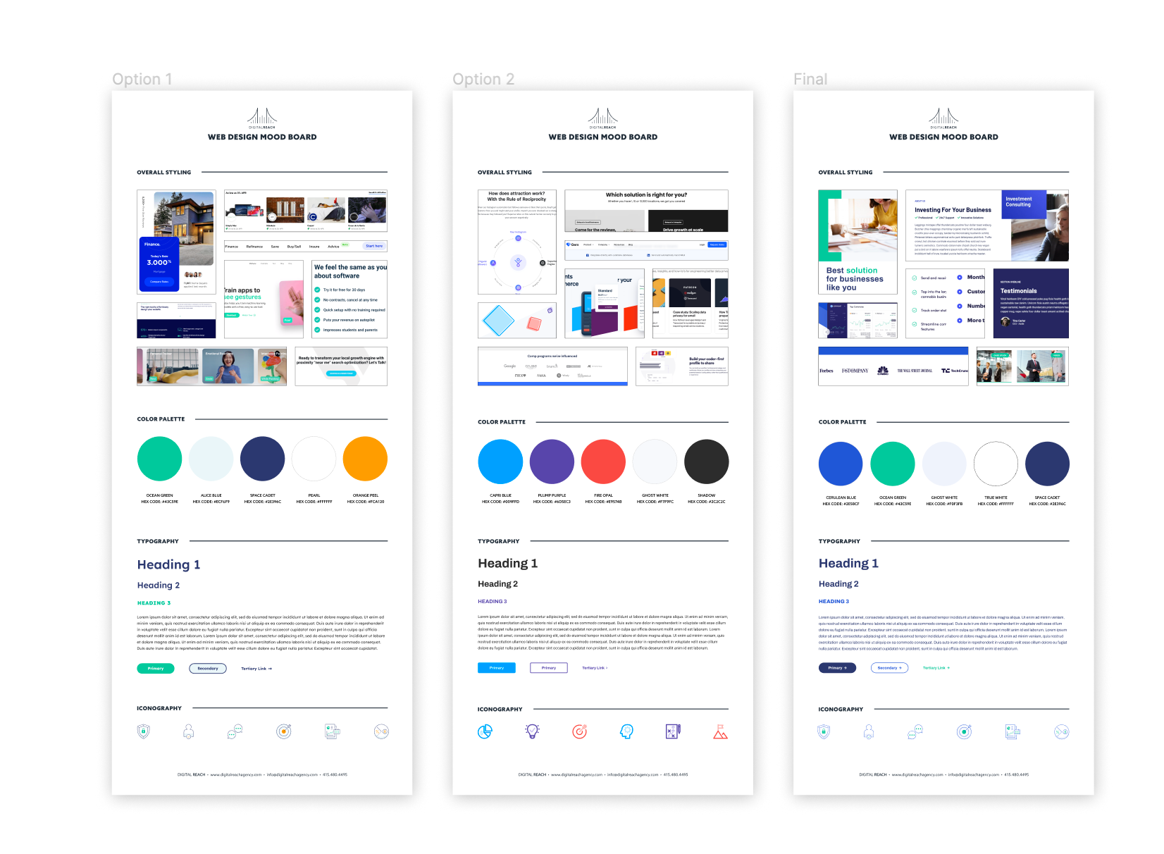
Moodboard options
Wireframes + Mockups
Tool of choice: Figma
Number of pages: 25
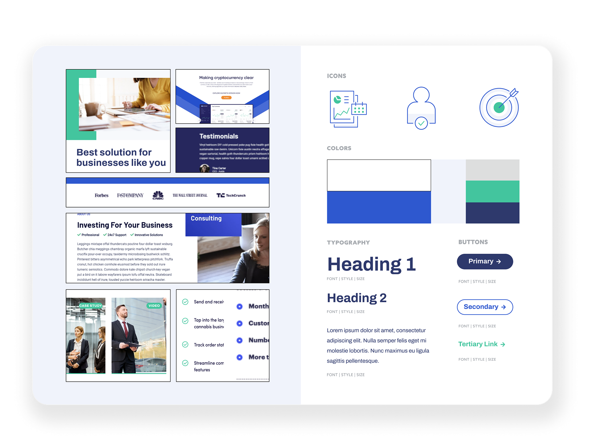
This was quite a labor of love. Working in tandem with my Creative Director, a new contractor, and the web dev team, I set out to create wireframes for the website that would drive conversions and encourage a more streamlined user journey. The web dev team was always there to advise if any mockup elements were potentially problematic to the scope of work. Go team!
Design System
Tool of choice: Figma
Includes: New color palette, custom icons, button styles, Illustrations, typography, container styling
What worked
📈 Increase in conversions
Post-launch, I met with the paid media team to see how the new website was performing. They reported a 40% increase in conversions (form fills)!
👁 Exciting new design system
The client was ecstatic to have a colorful, bold new design system from which countless campaigns could be grown. The custom illustrations and well-defined layouts made branding easy!
What didn't
⏰ Time
Due to some delays in getting timely feedback from the client, additional scope requests, but also on our end with actual development, we weren't able to meet their exact timeline.
💥 The scope exploded
The client ended up wanting some additional pages added to their sitemap, which set us back significantly in time and hours allocated.

