Brand Design, Style Guide, Website (in production)
December 2021
Agency Credit: Digital Reach Agency
7TC is a crypto fund with a focus on DeFi. They provide an end-to-end gateway to the cutting edge of crypto investment opportunities.
My role in this project was to create their logo and style guide while leveraging my creative teammates for their feedback and help as needed. We aimed to strike the perfect balance between serious and fun, while giving them a highly flexible, evolvable design system.
My role in this project was to create their logo and style guide while leveraging my creative teammates for their feedback and help as needed. We aimed to strike the perfect balance between serious and fun, while giving them a highly flexible, evolvable design system.
Constraints
⏰ Time
The client had a very limited timeline and needed this put together within 5 weeks.
💵 Budget
The client's budget was also quite limited with this being a pre-investors startup.
Measuring success
😍 The brand experience
If we would get the brand and style guide to a place that felt compelling, engaging, and aligned with their vision, it would be a win!
✨ Easy to use
The client would be passing this along to another team who would be developing their pitch deck, so it would have to be very easy to use.
Target audience(s)
– Poker community.
They're migrating into crypto and looking for someone savvy and forward-thinking.
They're migrating into crypto and looking for someone savvy and forward-thinking.
– Institutional money.
They're needing a secure and credible guide as they venture into crypto.
They're needing a secure and credible guide as they venture into crypto.
Both audiences are looking for a credible, safe way to invest in the DeFi space.
Moodboards
After completing a 3 hour Brand Sprint session with the client, I put together 3 different moodboards to convey different directions. I had my fellow designer take a look and provide feedback, which helped me tweak the final product. Ultimately, we were able to refine one of them into the perfect experience of warmth and sophistication that their ICP would respond to. This served as the guiding light for the next step.
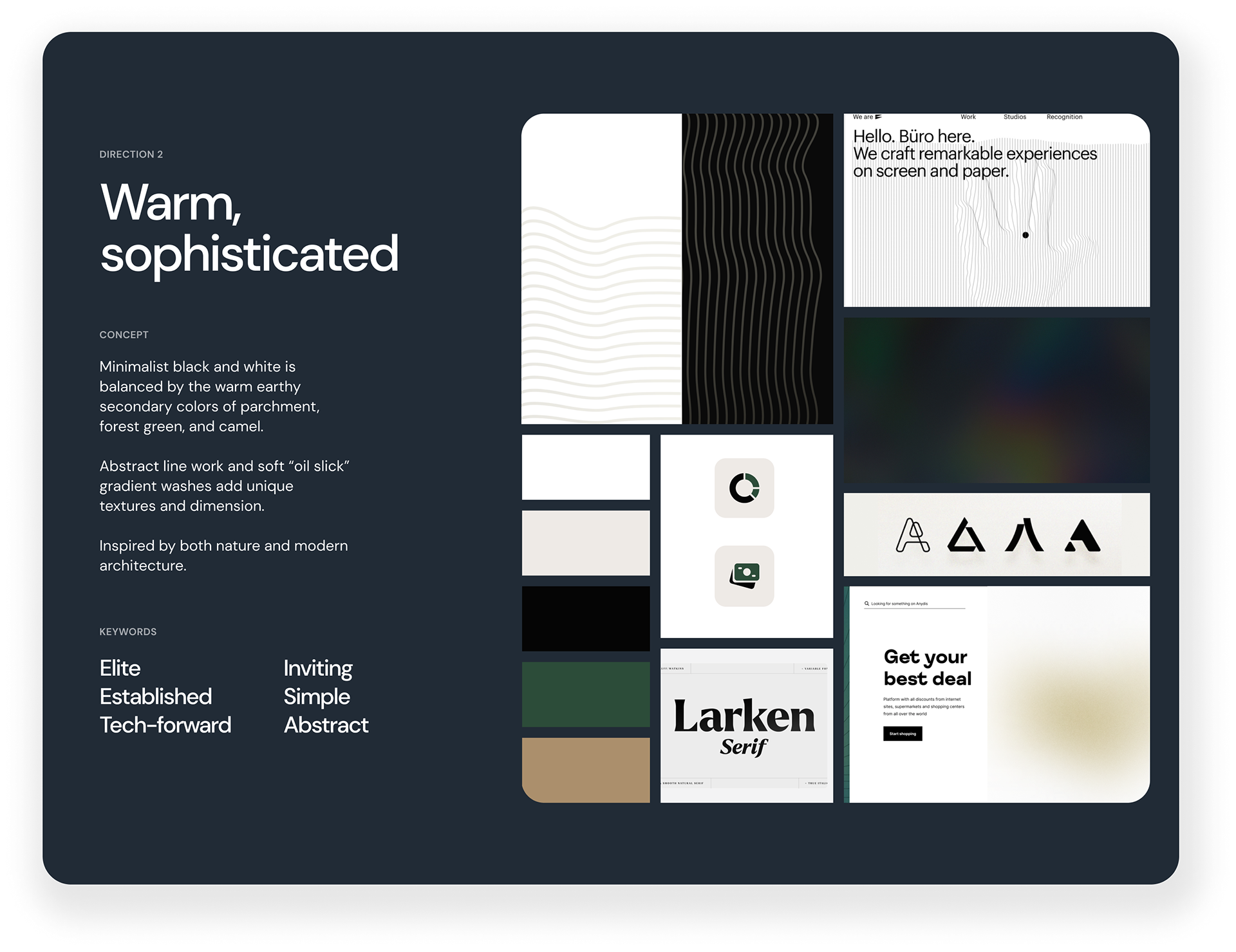
The winning moodboard concept!
The logo system
Flexible, timeless, tech-forward, minimalist. These were our primary goals for this logo system. I enlisted the help of a freelance designer to start exploring different iterations of the 7T initials (the client was committed to having this be their icon). From these initial iterations, I was able to build the final one that felt most balanced and met those primary goals.
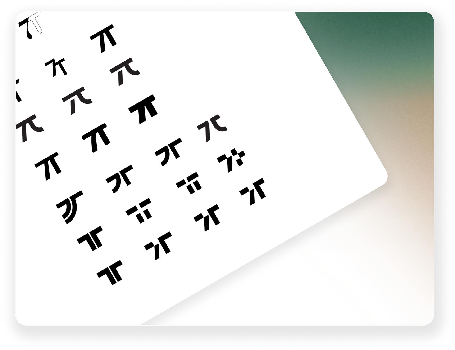
Initial exploration
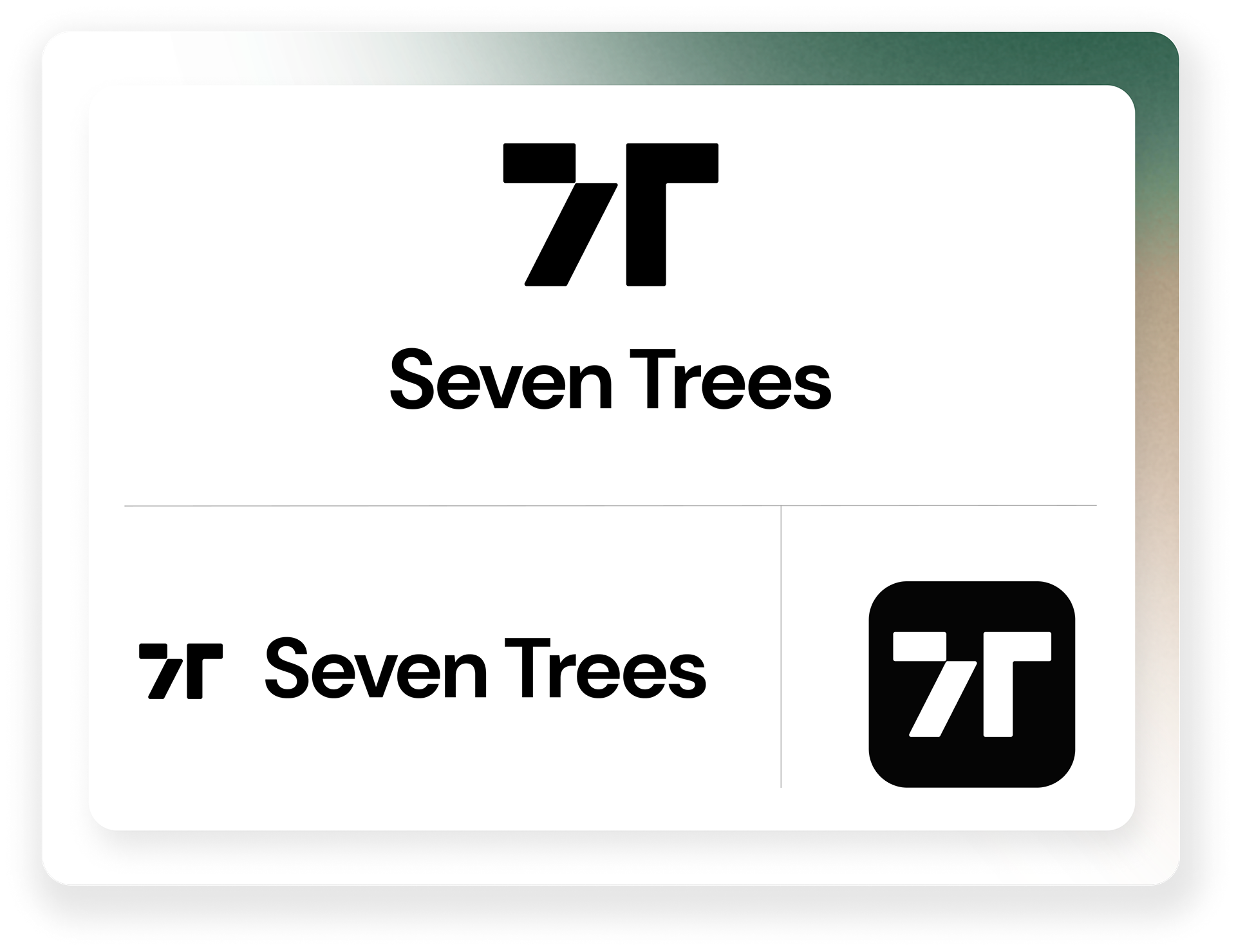
Final concept
Style Guide
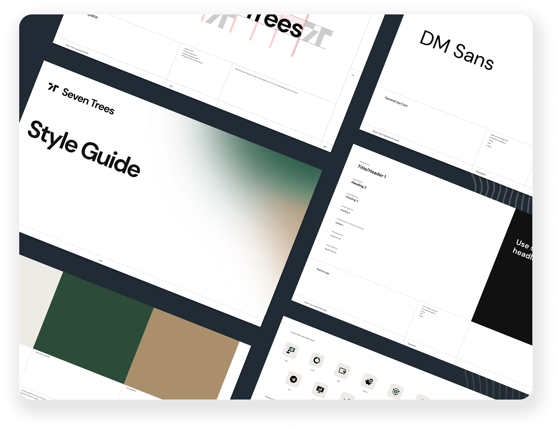
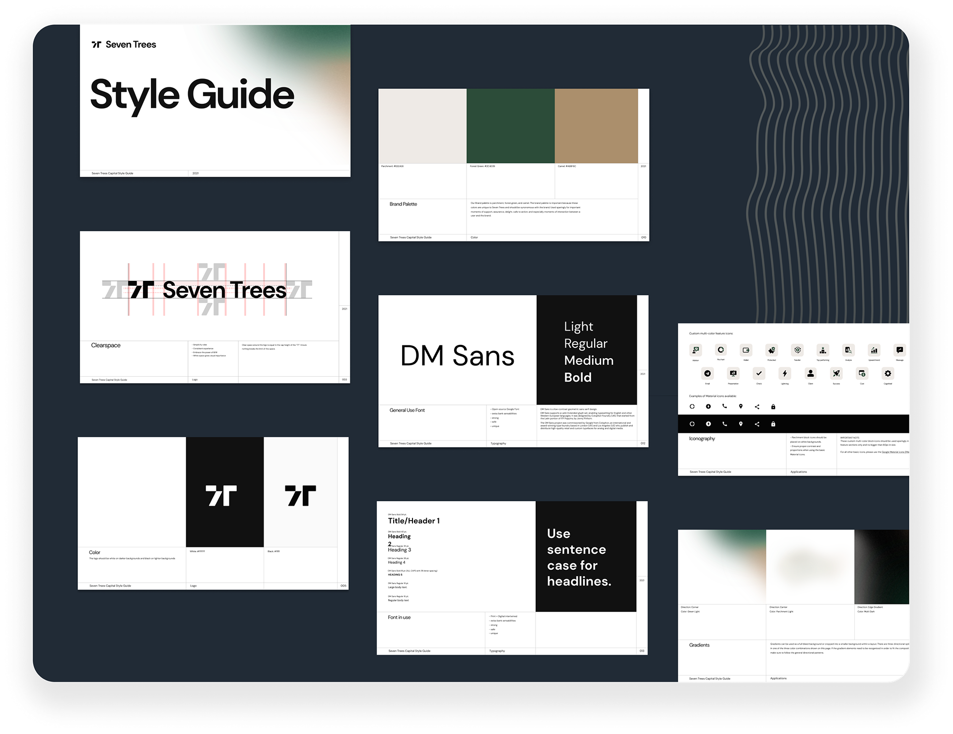
After approving the logo system, I put together an abbreviated yet thorough style guide they could send to their pitch deck team to start applying their new brand style right away. My co-designer, Cara, helped develop the gorgeous gradients that they could pull from.
What worked
⏰ Time
Despite the accelerated timeline, we were able to deliver the packaged files right on time!
🎉 The right logo
The client absolutely loved the logo we developed and felt it was the perfect balance of modern, flexible, and sophisticated.
What didn't
😵💫 A bit of confusion
There was some confusion for the pitch deck team when it came time to implement some of the style elements, specifically the icons. Next time, I'll be sure to offer more specific guidance there.

